-
[SwiftUI] Gradient, Icon, Image, FrameSwiftUI 2024. 8. 28. 00:01
안녕하세요. 1000JI입니다 :)
SwiftUI에서는 그라데이션 색상을 주는 것이 정말 쉬워졌습니다!
몇가지 예제를 보고 넘어갈까 합니다. (+ 추가로 다른 예제도!!)
Linear Gradient
// Linear Gradient(선형 그라디언트)
Text("Linear Gradient")
    .font(.title2)
RoundedRectangle(cornerRadius: 25)
    .fill(
        LinearGradient(
            gradient: Gradient(
                colors: [
                    Color.red,
                    Color.purple
                ]
            ),
            startPoint: .topLeading,
            endPoint: .bottom
        )
    )
    .frame(width: 300, height: 200)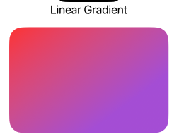
startPoint, endPoint에 따라 노멀하게 활용 할 수 있는 그라데이션 색상 입니다 :)
Radial Gradient
// Radial Gradient(원형 그라디언트)
Text("Radial Gradient")
    .font(.title2)
RoundedRectangle(cornerRadius: 25)
    .fill(
        RadialGradient(
            gradient: Gradient(
                colors: [
                    Color.black,
                    Color.blue
                ]
            ),
            center: .leading, // 중심점
            startRadius: 50, // 시작 할 때 Radius 크기 값을 지정
            endRadius: 300
        )
    )
    .frame(width: 300, height: 200)
Angular Gradient
// Angular Gradient
Text("Angular Gradient")
.font(.title2)
RoundedRectangle(cornerRadius: 25)
.fill(
    AngularGradient(
        gradient: Gradient(
            colors: [
                Color.blue,
                Color.yellow
            ]
        ),
        center: .topLeading,
		// angle: .degrees(180 + 45) // 각도 값
        angle: .degrees(75) // 각도 값
    )
)
.frame(width: 300, height: 200)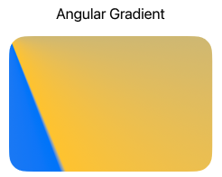
이런식으로 각각의 그라데이션 색상을 활용 할 수 있습니다 :)
Icon
struct IconBasic: View { var body: some View { VStack (spacing: 20) { Image(systemName: "person.fill.badge.plus") .resizable() .renderingMode(.original) .scaledToFill() .foregroundColor(Color.red) .frame(width: 300, height: 300) } } }- Plus 버튼은 아이콘의 고유 색상인 Original 버튼으로 되어있습니다.
- 'redermode'에서 'original'로 하게되면 실제 'color'에서 multi color 변경되게 됩니다.
즉, 고유 값 컬러로 변경되어서 color를 변경하더라도 변경되지 않는 컬러 값이 됩니다. - 만약 아이콘의 사이즈를 변경하고 싶다면?
resizable() 호출해야함 -> 이미지를 화면 크기에 맞게 조정해줌(크기 변경 때 꼭 필요)
Image
VStack (spacing: 20) {
    Image("nature")
        .resizable() // 크기 조정 시 필요함
        .scaledToFill()
        .frame(width: 300, height: 300)
        .cornerRadius(150)

    Divider()

    Image("nature")
        .resizable()
        .scaledToFill()
        .frame(width: 300, height: 300)
        .clipShape(.circle)
}
이미지는 따로 어려운 부분은 없으니 cornerRadius와 clipShape(.circle) 쓰는 방법을 참고하면 될 것 같습니다 :)
Frame
struct FrameBasic: View {
    var body: some View {
        // 1
        VStack (spacing: 20) {
            Text("Hello, World!")
                .font(.title)
                .background(Color.green)
                .frame(width: 200, height: 200, alignment: .center)
                .background(Color.red)

            Divider()
            // 2
            Text("Hello, World!")
                .font(.title)
                .background(Color.green)
                .frame(maxWidth: .infinity, maxHeight: .infinity, alignment: .center)
                .background(Color.red)

        }
    }
}
background를 여러개 쓴다해서 최종에 있는 color를 쓰진 않는다.
만약 예제처럼 font, frame이랑 같이 활용한다면 왼쪽에 보이는 예제 화면처럼 구현 될 수 있기 때문에 참고해야합니다.
두번째 예제 같은 경우 넓이 또는 높이가 최대 늘어날 수 있는 곳까지 늘어나게 해주는 것을 보여주는 예제입니다.
alignment는 텍스트의 위치 배열을 조절 할 수 있습니다.
struct FrameBasic2: View {
    var body: some View {
        // 3
        VStack (spacing: 20) {
            Text("Hello, World")
                .font(.title)
                .background(Color.red)
                .frame(height: 100, alignment: .top)
                .background(Color.blue)
                .frame(width: 200)
                .background(Color.green)
                .frame(maxWidth: .infinity, alignment: .leading)
                .background(Color.yellow)
                .frame(height: 400)
                .background(Color.purple)
                .frame(maxHeight: .infinity, alignment: .top)
                .background(Color.black)

        }
        .ignoresSafeArea()
    }
}
예제에 보는 것 처럼 꼭 View를 추가로 만들지 않아도 frame을 잡으면서 색상을 부여 할 수 있습니다. :)
.ignoresSafeArea()는 말 그대로 safeArea를 무시하고 영역을 채우게 됩니다.
이상으로 간단하게 예제 코드와 뷰를 살펴보았습니다.
이후 블로그 글도 동일하게 살펴보겠습니다!
'SwiftUI' 카테고리의 다른 글
[SwiftUI] Background, Grid, ScrollView 등(+View) (1) 2024.09.08 [SwiftUI] Preview, Text, Shape (0) 2024.08.26 [SwiftUI] SwiftUI란? (0) 2024.08.25